February 08, 2004
The Graph Evolves
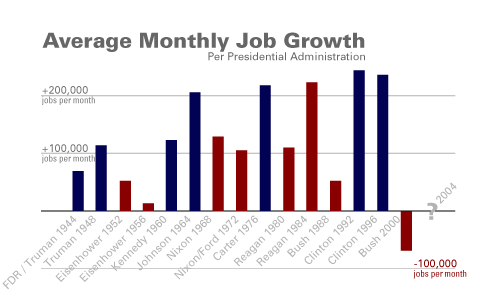
download the pdf, suitable for printing
designers, both amateur and professional are encouraged to download the Illustrator source file
based off a graph originally created by Music for America
Posted by William Blaze at February 8, 2004 02:23 PM | TrackBackThanks for creating the PDF. I like it -- mostly.
My opinions: The chart would be better without the "Your vote here" label. The year labels only add clutter. In this version the labels somehow obscure the nosedive into negative territory under GWB; perhaps the data would stand out better if the labels were a less saturated color.
I'd try tweaking this myself, but my old copy of Fireworks can't handle your jobchart.ai file (which downloads as jobchart.ps). Hey, IANADesigner.
It would be interesting to create a stack of charts across the same timeline, each summarizing a different statistic: job growth, federal deficit, income (at 90, 50, and 10 percentiles), etc. Perhaps one page of these could hint at the broad consequences of the various administrations.
Posted by: derfy on February 9, 2004 01:02 PMgood suggestions, I just updated the pdf. Let me know if it looks better or needs work.
thanks
A